Introduction to EEG-preprocessing
Methodological working in imaging neuroscience
Summer Term 2021
José C. García Alanis (he/him)
Research Fellow - Dep. of Psychology at Uni Marburg.
Affiliated - Child and Adolescent Psychology, RTG Breaking Expectations.
31/05/2021

@JoseAlanis
Before we get started
This materials are inspired by the NeurotechEDU tutorial on EEG-preprocessing. Yu can always refer to that site for additional, perhaps more detailed, materials on the techniques shown here.
We will be using the Python MNE library in this example:
What Is Preprocessing?
In general, preprocessing is the procedure of transforming raw data into a something that is more suitable for further analysis. After preprocessing, data should be easier to handle (e.g., less outliers, less “errors”).
With regard to EEG data, preprocessing is usually performed to remove noise and get closer to the “true” neural signals entailed in the “messy” EEG.


Why do we need preprocessing?
… several reasons …
The signals that are picked up from the scalp are not necessarily an accurate representation of the signals originating from the brain (e.g., missing spatial information).
EEG data contains a lot of noise which can obscure weaker EEG signals (cf. true signal).
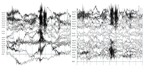
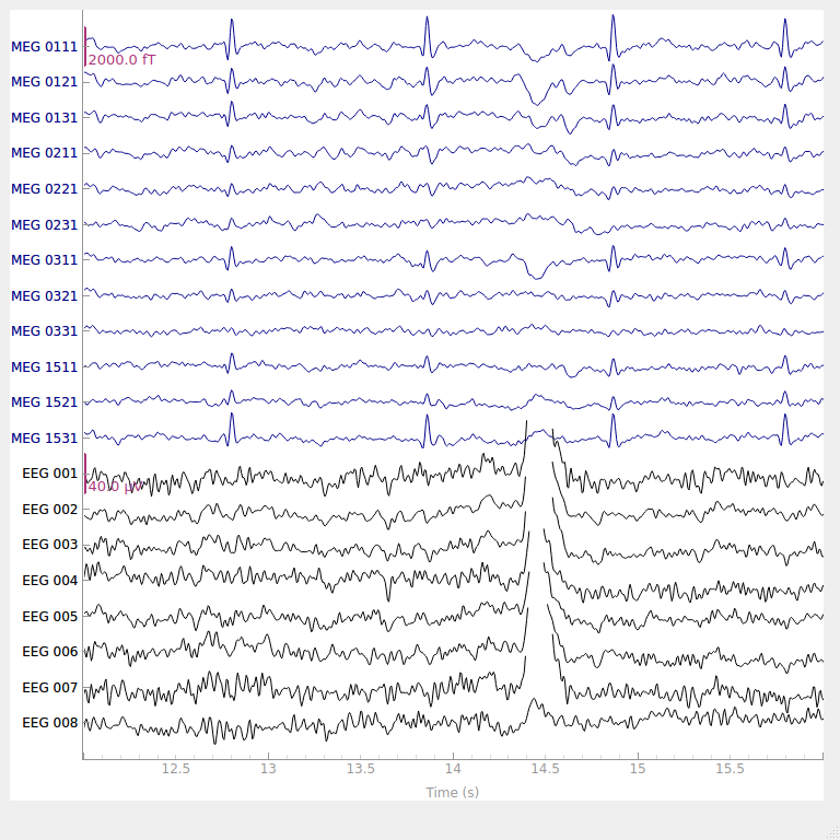
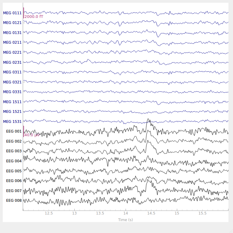
Artifacts such as eye blinks or muscle movement can contaminate the data and distort the picture.
We want to separate the relevant neural signals from random activity that occurs during EEG recordings (cf. true signal).
Typical steps in EEG preprocessing
Hands-on
# import mne

import mne
import matplotlib
import numpy as np
%matplotlib notebook

matplotlib.rcParams['figure.figsize'] = (5, 5)
First, load one of the MNE example datasets:
path = mne.datasets.eegbci.load_data(3, 1)
path[0]
Now lets read (i.e., import) the EDF file:
raw = mne.io.read_raw_edf(path[0], preload=True)
raw.info['chs']
from mne.datasets import eegbci

# set channel names
eegbci.standardize(raw)

# set montage
montage = mne.channels.make_standard_montage('standard_1020')
raw.set_montage(montage)
raw.plot_sensors(kind='3d');
Now that the Raw file has been created, we can plot the data:
raw.plot(scalings = dict(eeg=200e-6)); # +/- 200 µV scale (1 V = 1000000 µV)
Note:
(just for demonstration purposes, you can skip this if you like, continue in 11.1)
It is also possible to create a raw file from scratch, given the channel names, sample frequency, and an array of data
ch_names = ['A', 'B'] # channel names
sfreq = 200 # sampling frequency, in hertz
info = mne.create_info(ch_names, sfreq) # See docs for full list of Info options.
samples = np.array([[-1, 0, -1, 1, 1], [0, 1, 0, -1, 0]]) # Samples for each channel
loadedRaw = mne.io.RawArray(samples, info)
loadedRaw.plot(scalings='auto');
Look at characteristics of the Raw file
E.g., look at the power spectral density plot of our data.
%matplotlib notebook
raw.plot_psd(tmin=0, tmax=60, fmin=2, fmax=80, average=True, spatial_colors=False);
Filtering
Now that we have the raw data, we can filter the data to select the frequencies we’re interested in.
We want to remove the 60 Hz power line noise. If we want to “remove 60Hz” but keep other frequncies, we can use a notch filter see here for instance.
Alternatively, if we want a a filter that “lets pass” all the frequencies below 60 Hz but removes everithing else, we can use a “low-pass filter”. Here we can set an “upper cut-off” for the filter by setting
h_freq=50.0. I use a conservative 50.0 Hz cut-off (and not 60.0 Hz) because filters have transition bandwidth, meaning that they will “affect” frequencies around the target frequency to a certain degree, but not remove them completely (i.e., thepassband edgewill be somewhat avobe the target frequency, see filter summary in the next slides).Conversely, we can use a “high-pass filter” to remove frequencies below a certain frequency. Combined, high and low pass filters constitue a “band-pass filter” (i.e., lets a certain band of frequecies pass.)
You can see here for more information on filters and implementation in MNE-Python.
# set notch filter
raw.notch_filter(60)
Now we can remove very high and very low frequencies that are unlikely to contain the signal that is relevant to us.
raw.filter(l_freq=1.0, h_freq=50.0) # only keeping frequencies between 1-50 Hz
Notice how filtering changes the shape of the power spectral density plot:
raw.info['sfreq']
We can now downsample the data:
# Downsample a lot
raw.resample(120, npad='auto')
raw.plot_psd(tmin=0, tmax=60, fmin=2, fmax=60, average=False, spatial_colors=True, xscale='log');
# Notice that the max plotted frequency is 60, the nyquist rate!
After filtering and downsampling, we can look at the raw data again to see if there are any bad channels:
raw.plot(scalings = dict(eeg=200e-6));
You may notice from the plot above that the channel C4 looks significantly noisier than the others. We can then flag it as a ‘bad’ channel and remove it:
raw.info['bads'] = ['C4']
picks = mne.pick_types(raw.info, exclude='bads')
raw.plot(scalings=dict(eeg=200e-6), bad_color='red');
Now that we have marked a channel as bad, we can interpolate the data coming from that channel via spherical spline interpolation.
In order to be able to do that, we need to make sure that our channels have location information:
print(raw.info['chs'])
You can see that all the locations (the ‘loc’ attributes) are at 0, meaning that we don’t have accurate location info. However, assuming that the data was recorded from a headset using the standard 10-20 system, we can load a pre-configured channel location file and use that instead.
Now we can interpolate the bad channel and see what the reconstructed channel looks like.
raw.interpolate_bads(reset_bads=True)
raw.plot(scalings=dict(eeg=200e-6));
Now that we have somewhat cleaned-up data, we can run ICA to try and localize the signal:
from mne.preprocessing import ICA
# play around with this number to get components
# that seem to represent the actual brain activations well
num_components = 15
ica = ICA(n_components=num_components, method='fastica')
ica.fit(raw)
Once the components have been computed, we can plot them on a model of the scalp:
ica.plot_components();
We can now reject components that appear artifactual. To do so, we can visualize each component’s properties first:
raw.plot(n_channels=32, scalings=dict(eeg=100e-6));
This might seem like a lot of information. One commonly used heuristic is looking at the spectum of each component. Ideally, each spectrum will have a \(\dfrac 1 x\) - like shape:
ica.plot_properties(raw, picks=0); # This exact component number probably won't work if you recompute ICA
…while outlier components will have increasing intensity for higher frequencies, like in this example:
ica.plot_properties(raw, picks=9); # This exact component number probably won't work if you recompute ICA
We can now see what our data looks like with the bad component removed:
ica.plot_overlay(raw, exclude=[0]);
ica.exclude = [0]
ica.apply(raw)
raw.plot(scalings=dict(eeg=200e-6));
